Big UI and clarity changes

Hi,
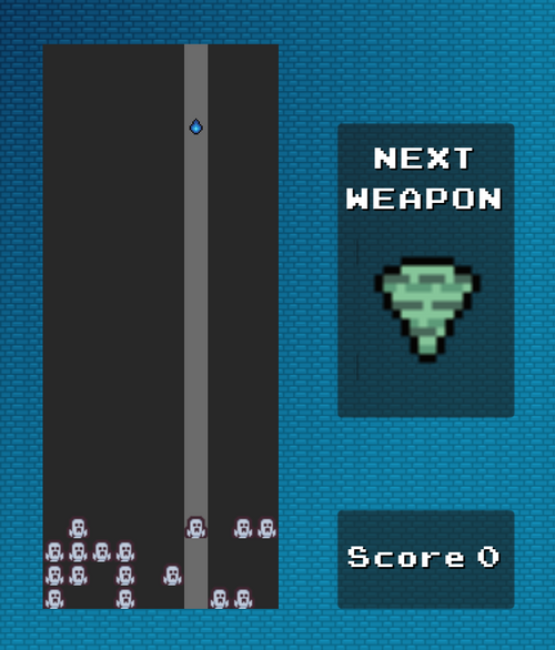
After one exam today I decided to rest before studying tomorrow and the day after tomorrow (seriously). And pushed all changes I wanted to put in here in the last update. The last ones were quite important so I uploaded it here yesterday so the game feels playable at least, but now I hope it looks and feels better. I mostly touched some UI stuff along with changing sprite for the monster and adding some features that increase the game clarity. I added how to play and controls section which I hope are not too big, I was trying to make them as straight-forward as possible.
For the UI, I changed the fonts, sizes, made sizes of buttons equal etc etc..
Please take a look, give me some feedback about game balance, difficulty or any bugs You can find (PLAY AGAIN BUTTON still doesn't work I know ;-;)
Elementris
Reversed Tetris with Abilities
More posts
- Elementris artJul 05, 2024
- Elementris small updateJun 30, 2024
- Quick QOL update changesJun 24, 2024
- First "Elementris" Demo ReleaseJun 23, 2024
Leave a comment
Log in with itch.io to leave a comment.